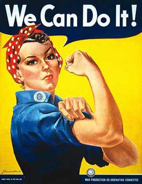
Original Ad:
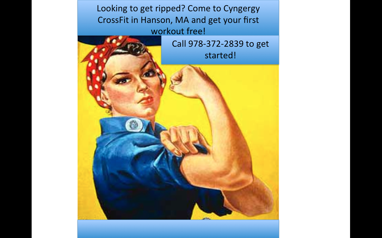
Remake of Original Ad:
The original ad I chose is called “We Can Do it!” or is sometimes known as “Rosie the Riveter”, which was an American wartime propaganda poster that’s message was to boost worker morale. Although the ad was not seen very often in it’s time period during World War II, it was rediscovered in the 80’s and was used to promote feminism, promote women to keep working hard, and other political issues. Although this ad was not popular or really seen at all until a whole after it was created, it is seen very often even today and is used to advertise a variety of different messages to audiences.
I chose to rework the “We Can Do It!” ad because it is still very famous today and it is not uncommon that you see it in many different forms to advertise or promote different things. Because the image is very broad (just a woman flexing her arm muscle), it can communicate a variety of messages if conveyed correctly. To prove this, I decided to utilize the fact that it conveys women’s strength and empowerment, so I made it a women’s cross fit ad. I replaced the original words “We Can Do It!” and replaced them with “Looking to get ripped? Come to Cyngergy Cross Fit for Women in Hanson, MA and get your first workout free! Call 978-372-2839 to get started!” Because the image is so general and portrays a woman flexing a muscle, the first thing that came to my mind to remake the ad was some kind of workout theme. Cross Fit is really popular these days and is very rigorous in terms of strength training so I figured that would be a perfect theme. I really liked the way this ad looked with the Cross Fit theme because the women displayed is dressed in work clothes and a red bandana on her head, which implies that women are strong and have been for a very long time. It therefore not only conveys the Cross Fit message, but also conveys to women that women are powerful and strong and always have been so they can be a part of carrying that on into the future. I like how the colors in the ad are feminine, yet not “girly”. The colors help the ad say that it is for women, yet don’t go so far to make it look prissy or like a kind of workout center that is a joke and shouldn’t be taken seriously. I think this oppositional reading is very effective and I could even picture it being a real ad that I would pass on the street or in communities (assuming that it’s design quality was more professional and not done on PowerPoint ;)) I love the original message of this ad that conveys female empowerment and strength and how that message continues to be sent through the several remakes of this ad, no matter what it is actually advertising.
