Font Poem Collage
Leave a reply


Viewing the brain anatomy didn’t so much influence me to want to change any behaviors to improve my brain functioning; it more so just taught me what there was to know about brain function and what parts of the brain do what. If anything, it just makes me want to be more aware with everything I do, knowing that I am doing something because a certain part of my brain is working and responding. For example, the next time I am hungry, instead of overlooking the feeling, I am going to be very aware that it is my hypothalamus in my limbic system controlling the feeling.
Viewing the brain anatomy really helped me to understand the brain functions even better than I already do. It’s funny because being a psychology major I’ve learned all about the brain and its functions several times, but it never completely sticks 100% when the lesson is over. I feel that if we were to use a 3D program like this to put a visual with the information I would retain a whole lot more than I do when reading off a slide.
I think this is a great example of “the truth can be made visible” or “visual truth” because this program is taking hard facts and putting them into a visual representation, by matching information with a picture, that is much easier to understand. This program is really easy to navigate and follow which is why I think it’s so effective. I remember when being taught about this in high school AP Psychology we were given sheets of paper with a diagram of a brain with all sorts of lines jetting out from different parts. Because the brain is so complex and dimensional, it was hard to figure out which part of the brain was which because each diagram of the brain I got looked slightly different depending on which view it was from. The 3D view of the brain in this program makes learning a lot easier and represents the visual truth exceptionally.
http://www.youtube.com/watch?v=twhvtzd6gXA
The ad I chose was a commercial for the drug Zoloft, which is an antidepressant. It lists symptoms such as sadness, hopelessness, anxiety, loneliness, loss of interest and exhaustion to interpellate the viewer and to try to make them feel a connection.
The condition that the drug in the ad is intended to treat is the chemical imbalance between nerve cells and the brain that is a known factor in the cause of depression.
The list of side effects includes dry mouth, insomnia, sexual side effects, diarrhea, nausea, and sleepiness. The list of side effects is equally as long as the list of symptoms, each including 6.
This ad promises the consumer that their depression and its symptoms will help to be cured and they will feel better. The ad consists of a little creature outside that is stuck under a raining cloud that follows it wherever it goes. Then after explaining how the drug works, we then see the creature again and the cloud disintegrates and there are suddenly yellow flowers and a blue bird in the scene that used to be all black and white. This implies that their life that was once empty and almost a blur can turn into something with meaning, purpose, and light with use of Zoloft.
Pastiche Exercise 1

http://flavorwire.com/411724/50-things-you-didnt-know-about-the-wizard-of-oz/

http://www.pettipond.com/frou_tv.htm
Unfortunately I could not find the clip on youtube, but I bought the episode on iTunes to reference and i tried to screen record it while I was watching the scene it but it only got the audio, but it is still a pretty decent representation of what is going on!
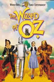
1. This pastiche is a reworking of the past because “That’s So Raven”, a Disney Channel original sitcom that went from January 2003-November 2007, remade the story of the 1939 classic film “The Wizard of Oz” to fit into their own plot. In the episode called “Soup to Nuts”, Raven is faking sick to avoid being punished for spilling beads all over the floor by accident and having her principal with a bad back slip on them. When she’s home, her Dad feeds her this extremely spicy soup that makes her a little delusional. While she is watching TV she flips the channel on to what looks like is the Wizard of Oz, but she is Dorothy, and Eddie, Chelsea, and Cory are the scarecrow, tinman, and lion. Similar to the film, they walk into Oz’s lair with the remains of the Witch of the Wicked West, when they see “Oz” as a floating head, played by her dad. Eventually they discover that Oz is just a man on an elliptical machine behind a curtain speaking into a microphone. Then the Wicked Witch of the West comes in, played by her principal, and when she tries to melt him with water, he doesn’t. This popular TV show like many others took a well-known storyline of the past and made it their own for entertainment purposes.
2. This is definitely a pastiche with a parody because it takes what actually happens from the original movie and keeps it to a certain point, but makes certain parts funny. For example, at the end of the original movie Dorothy pours water on the witch and she melts. At the end of this scene, Raven as Dorothy pours water on her principal as the witch and steam rises as if he is melting like in the movie but he remains there and says “I’m not melting” instead of “I’m melting” while he flicks water from his hands onto her. Raven then says “Water on weave, I’M melting, I’m melting!” This is a perfect example of how this episode makes it a parody by taking the melting scene and then having Raven be the one that melts because he got water on her hair weave. Attached is the scene if you would like to reference it.
3. This work questions the status of the original because it kind of makes fun of it and does it to their own standards. A lot of TV shows do this, where they take a piece of a former popular concept and makes a parody of it. Also, the technology in 2003-2007 was much better than what they had in the 1930’s so it makes it a lot more presentable and brings it to life a little more.
Pastiche Exercise 2
 1. The individual graphs and the website as a whole are pastiches because they are taking formal formats for graphs, charts, and visual representations and making their content about silly things. For example, in this format of a pie chart, we can see that it isn’t measuring anything substantial, but what you did with a ruler when you were a kid: measuring and work in blue or spinning it around a pencil in orange, and almost the whole chart is orange. This is a reworking of the past because you wouldn’t have seen jokes like this or things making fun of formal formats like these several years ago, so this time period has definitely found a way to rework the past formal formats and make it their own.
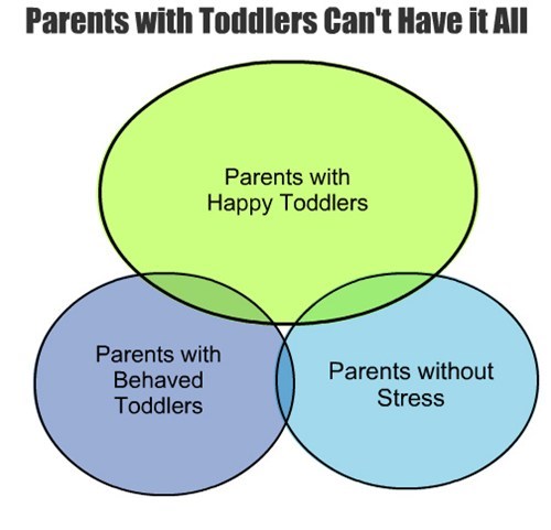
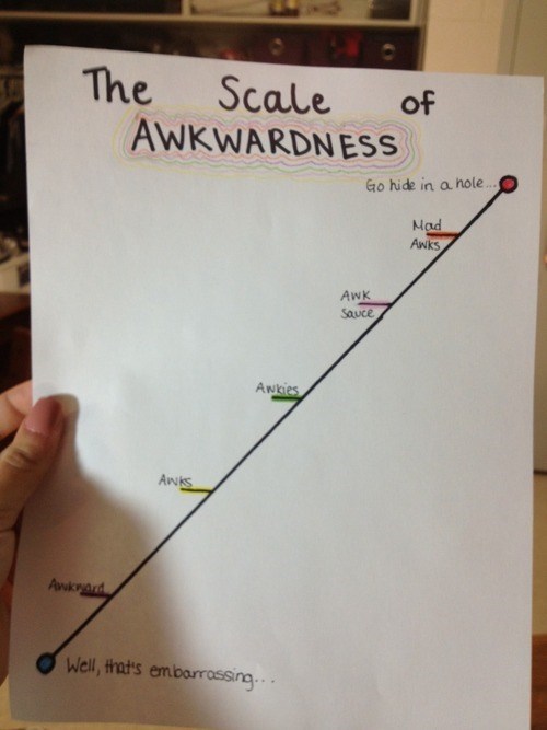
2. This pastiche is definitely a parody because it almost mimicking the original formats and making them into a joke. Other examples I found are “Parents With Toddlers Can’t Have It All” representing that parents with toddlers have very little chance of not being stressed all the time, and also “The Scale of Awkwardness”, which measures awkwardness on a scale of awkward to “mad awks”.
3. This work questions the original because you would never see a professional looking graph or chart measuring silly stuff like this in the past. These kinds of formats you would normally see in a classroom or a professional presentation measuring whatever was being studied or tested, not something like a ruler being used for helicopter blades or the scale of awkwardness.
Original Ad:
Remake of Original Ad:
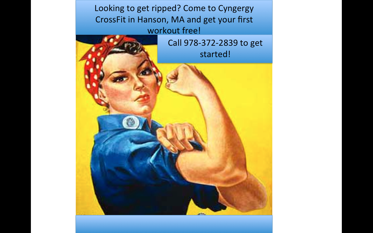
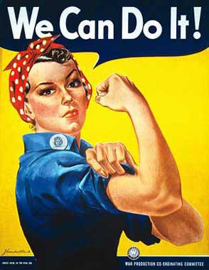
The original ad I chose is called “We Can Do it!” or is sometimes known as “Rosie the Riveter”, which was an American wartime propaganda poster that’s message was to boost worker morale. Although the ad was not seen very often in it’s time period during World War II, it was rediscovered in the 80’s and was used to promote feminism, promote women to keep working hard, and other political issues. Although this ad was not popular or really seen at all until a whole after it was created, it is seen very often even today and is used to advertise a variety of different messages to audiences.
I chose to rework the “We Can Do It!” ad because it is still very famous today and it is not uncommon that you see it in many different forms to advertise or promote different things. Because the image is very broad (just a woman flexing her arm muscle), it can communicate a variety of messages if conveyed correctly. To prove this, I decided to utilize the fact that it conveys women’s strength and empowerment, so I made it a women’s cross fit ad. I replaced the original words “We Can Do It!” and replaced them with “Looking to get ripped? Come to Cyngergy Cross Fit for Women in Hanson, MA and get your first workout free! Call 978-372-2839 to get started!” Because the image is so general and portrays a woman flexing a muscle, the first thing that came to my mind to remake the ad was some kind of workout theme. Cross Fit is really popular these days and is very rigorous in terms of strength training so I figured that would be a perfect theme. I really liked the way this ad looked with the Cross Fit theme because the women displayed is dressed in work clothes and a red bandana on her head, which implies that women are strong and have been for a very long time. It therefore not only conveys the Cross Fit message, but also conveys to women that women are powerful and strong and always have been so they can be a part of carrying that on into the future. I like how the colors in the ad are feminine, yet not “girly”. The colors help the ad say that it is for women, yet don’t go so far to make it look prissy or like a kind of workout center that is a joke and shouldn’t be taken seriously. I think this oppositional reading is very effective and I could even picture it being a real ad that I would pass on the street or in communities (assuming that it’s design quality was more professional and not done on PowerPoint ;)) I love the original message of this ad that conveys female empowerment and strength and how that message continues to be sent through the several remakes of this ad, no matter what it is actually advertising.
Over the past 48 hours, I have recorded all the media that I use whether it’s a lot or a little. The media I recorded consists of Facebook, Twitter, Tumblr, Instagram, Gmail, Orgsync, Youtube, TV, Texting, Phone Calls, and Music (Pandora/8tracks). This was shocking to me because these things have become such a part of my daily routine that I don’t even realize how much I actually use them. I have Facebook, Twitter, Tumblr, Instagram, Gmail, Orgsync, and Youtube, bookmarked on my sidebar and I have to check them all the first time I go on my laptop for the day and the last time for the day before bed. These kinds of routines I didn’t even realize I did until I had to do this assignment.
I used music the most. I spent about 9 hours altogether listening to music in one way or another over the past 48 hours. I use iTunes, Pandora, 8tracks, and in dance rehearsals I have to listen to music obviously.
I used phone calls the least. My mom called me quick to ask me a question yesterday and the conversation was no longer than 5 minutes.
There was a significant amount of time communicating with other people over media. I realized that I used texting, phone calls, Facebook, Gmail, and even Twitter to communicate with others. Aside from phone calls, I realize that I use each of these media’s a significant amount in communicating with people in my life too, it’s not just here and there.
Because I listen to music when I do homework and watch TV when I go to bed, there was also a significant amount of time (probably 11 hours) that I spent using monologic media. I usually use Pandora Radio or 8tracks on the Internet to stream music that is meant to fit the mood I’m in or the artist I want to listen to. Also, I’m a dancer and I’ve had 4 rehearsals the past 48 hours, which the majority of the time is spent dancing to the selected music. For TV, I always have it on when I go to bed at night. I usually watch a half hour of TV, and then I leave it on in the background for a half hour while I try to fall asleep.
I really was shocked by the amount that I use media. Actually, not even how much I particularly use media, but just how mainstream and everyday media has become to be. Half the things that are media that I use I don’t even really consider media anymore because its so routine now, so it was really eye-opening to see how much media I actually use on a daily basis.
I am definitely going to try to decrease my everyday use of media by at least a little. I don’t want to be part of the statistic or norm that this generation is so media obsessed and is losing all interpersonal skills. I am going to try to do this by texting and using Facebook less. Those are 2 things that I feel it is reasonable to cut down on. Although it is technically the easiest form of communication, especially because everyone is so busy and on the go, it would still benefit me to try to have more one-on-one conversation and take my eyes off my phone and computer screen.
In class, we have been studying mechanical reproduction and “the copy”, meaning that once an original piece of art or photography is created, people remake their own versions of that original, reproducing it or copying it on their own. Aside from taking away the essence and a lot of times the intended meaning of the original work when it is attempted to be reproduced, there is generally no fuss about it as long as proper credit has been given to the original artist or photographer instead of the copying artist taking credit for an idea that they didn’t think of themselves. The way that Creative Commons works, is they are the central networking system for people to be able to share and expand their photographs, blog posts, music, and other original material, but only with the proper copyrights given. So, anyone can post anything they’ve created onto the site, and when someone else wants to use any of that work for something of their own, Creative Commons will only allow them to take it with the proper copyrights attached so that the original artist gets all the credit. This alters the way we understand ownership and copyright because in this day, especially with famous photos, quotes, icons, etc, people take things without permission or without knowing who actually created it which is technically stealing and is unfair to the original creator. This website really emphasizes the importance of “giving credit where credit is due”, which is a great thing because it allows the Internet to reach it’s full potential in an appropriate and fair way.
This project affects the subject of a work greatly because when there are several original works available to be borrowed and even modified by the rest of the world, it takes away a little bit of the essence and significance of the original. When something id all of a sudden on the Internet and available to anyone on CC, it spreads quickly and to other parts of the world rather than if the work was just confined to one person or establishment. Once an idea is out there, even if it is not copied, it gives people the opportunity to run with the same idea, but just to carry it out a little differently.
Creative Commons could have altered the works cited in the text Gone With the Wind, the work of Sherrie Levine and Michael Mandiberg because it allows characters to continue on past that one book. A lot of times during “spinoff” or duplicate editions, the same characters are used from a certain original but put in a different plot or story. This is not fair because one person came up with all of those individual characters and every detail about them, so for someone else to be able to take that with no complications is completely unfair. Creative Commons might be able to put a lock on the works cited for Gone With the Wind so that spinoffs or taking of the characters or plot in a slightly different context could not happen.
I think that the Creative Commons Project affords protection to the right of publicity because the CC does not allow works to be used for commercial purposed without the proper consent of the owner. If permission is given, which it not always is because a lot of artists or creators don’t want their creations out for superficial show, but if it is the right to publicity is granted and they can move forward in their efforts.
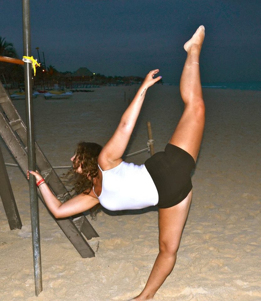
For my empirical representation of myself, I used a picture of myself from this past summer on vacation in Mexico where I am dancing on the beach. I picked this photo specifically because when I was reading the questions we have to answer for this assignment, one of them asks if there are any areas of intersection between the empirical and symbolic representations of myself. Dance is something that is really important to me and something that I love to do, so I figured that since I knew it was going to be incorporated somehow in my symbolic representation, I should overlap it with the empirical too.
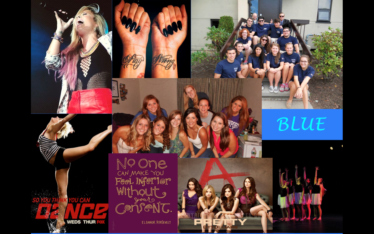
My empirical representation is different from the symbolic because it is simply a photo of myself, but not necessarily telling a whole lot about me except for the fact that I dance. That is pretty much all you are able to infer; not who I am as a person, what my other interests are, who I hang out with, who I look up to, etc. In my symbolic representation, there is not a physical picture of me, but anyone looking at it can tell a whole lot about my personality and interests. Again, the main area of intersection between the 2 representations is dance. In the empirical photo, I am doing what is called a “ponche” in dance terms. In my symbolic representation, on the bottom right corner, you can see a photo of 5 other girls and I performing a piece at the Dance Club Show that happens every semester, and then on the left hand corner you can see that I love the show “So You Think You Can Dance?”, so dance is definitely visibly incorporated in both. Along with that, I also have a picture of Pretty Little Liars because those 2 are my favorite shows. As for the rest of the symbols, I chose them all because they are key parts of who I am and what has built me through the years. On the top right, I have 2 photos of Demi Lovato (1 of her singing and 1 of her tattoos an her wrist). She is my favorite artist and is a complete inspiration to me. I look up to her tremendously and she has really helped me through the past few years. Moving along the top and middle, I have pictures of my RA staff and friends here at RWU. I have met a lot of new friends this year on my staff that I know I will have for several years to come, as well as my friends that I had before this year as an RA. Both new and old, they are all amazing people and I am so thankful to have them all in my life now. On the bottom, I have my favorite quote by Eleanor Roosevelt saying, “No one can make you feel inferior without your consent.” This quote I feel describes who I am to a tee. I am very independent and I don’t take negativity from anyone. I know who I am and I’m confident about it so I don’t let other people or any outside sources bring me down because I am comfortable and confident with who I am and that’s all that matters. Finally, blue is my favorite color so I thought I’d throw it in there!
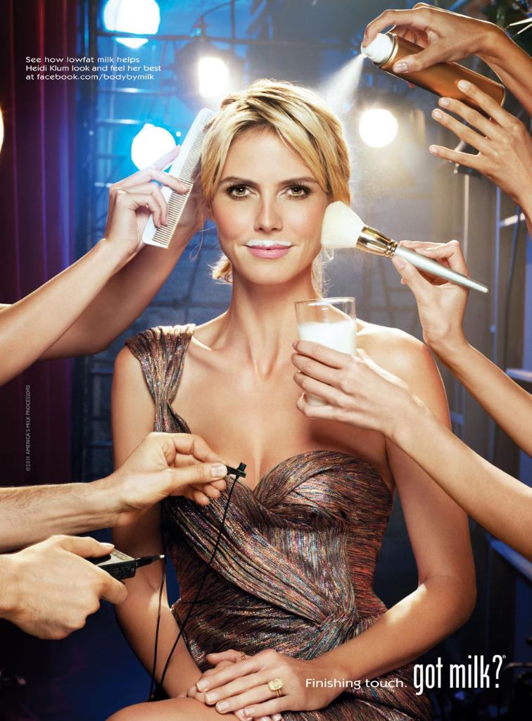
In the first advertisement I had to choose with only one person, I chose an ad for milk that includes famous model and actress Heidi Klum who appears to be on the set of a fashion show, movie, or awards show of some sort because there are several bright lights in the background and she is clearly being prepared for something since she is in a fancy dress and getting herself done up by her people. She is sitting in a make up chair while 8 different hands are touching up her make up, combing her hair, putting in hairspray, about to attach a clip-on microphone to her dress, and most importantly for this ad, holding out a glass of milk in front of her. Heidi Klum is clearly aware that she is the object of the photo in this advertisement. I know this because even though she is clearly in the middle of a very high energy and high pressure setting with multiple people surrounding her doing all sorts of different things, she is staring not at them or the lights or anything else around her, but staring dead-eye into the camera with a little smirk on her face with the classic milk mustache for all of the “Got Milk?” promotional ads or commercials. She has a look of compete content on her face, which seems to come from drinking the milk that is in the glass in front of her. This ad also seems to pair the milk as the fuel for all of her success and as soon as she drinks it shell be sent off to do what she does so well.

The advertisement I chose that had two people is an ad for Gucci perfume. The characters appear to be two young adults in their mid 20’s in a setting of sexual intercourse. This ad is clearly about how the perfume will make men fall all over you, so they cleverly made the tag line “Gucci Guilty.” It flows, it’s catchy, and it follows the theme of womanly seduction. In the photo, the male seems to be completely tranquilized and mesmerized by the female because his eyes are closed, as he smells her neck. The woman, on the other hand, is looking directly into the camera with a look of stance and power. Her look says “I am sexy and beautiful and this man will follow me around like a puppy dog trying to win me over”…or at least that’s what I think. I also know that she holds the power because of the positioning of their bodies. They positioned her so that she is above him with eyes wide open and a look of seduction, while the man is positioned below her with his head in her neck slowly becoming more and more attracted to her. It makes sense since it is a women’s fragrance that she should be in power, so in addition they put the bottle of perfume on her side so it again gives her the upper hand.
Appropriation is defined as someone taking something for their own purposes without consent (similar to plagiarism), and cultural appropriation is the process of borrowing and changing the meaning of cultural products, slogans, images, or element of fashion. At the top of the page, you will see an advertisement that is probably familiar to you, but now with a strange twist. The original meaning of this ad before the appropriation happened was to advertise the iPod. Normally the ad consists of a fun, colored background with a blacked out figure of a person dancing and looking like they are having fun. The key objects to communicate this is the white iPod and headphones leading from the iPod to the person’s ears where the music flows, being the reason they are having so much fun, or so it looks. This image has been appropriated to advertise or promote the war in Iraq. The colored background, blacked out figure, and white “headphones” are still there so a viewer can clearly tell that it is a spinoff of an ad for the Ipod. What is different is the blacked out figure is a man who appears to be turned away to the side (the figure is usually turned to the front) and holding a gun or weapon of some sort. Aside from the words Iraq, the gun is definitely what I would say is the main indicator in this ad that this image has been shifted from something positive to negative and that it is about war. The white headphones now appear to be part of the gun that is attached to the man’s belt. Where the white apple and the word “iPod” usually is now says “iRaq”, which is another clear indicator that this ad has been appropriated because the “R” in Iraq is capitalized, like the word “P” is in iPod normally would be. The new meaning intended through the appropriation of the ad is apparently in promotion of the war in Iraq. I think it’s one thing to promote or commercialize war or something that is so controversial and violent in most places, but it takes it another step farther to pair such a concept with a positive image like the iPod. Because of the preconceived notions that viewers already pair with iPod ads, it makes the idea of war and violence almost fun, light, airy, and enjoyable. The iPod ads are intended to make people want to get up and dance while listening to fun music. It sends a positive and easy going message. This message is completely contradicting now that it has such an opposite message recreating it. For this reason, I don’t think that this is an effective advertisement; the two different ends of the spectrum are too conflicting. This example I think poses as cultural appropriation because the artist is clearly seeking to make a statement that opposes the original dominant ideology, therefore causing it to have a doubled meaning that builds on the stigmas and expectations of the original.

